Design Principles/ Exercise 1
Design Principles
Week 1/2
1.1: Elements and Principles of Design
The elements of design are the building blocks of what a visual artist or graphic designer uses to make a successful composition. The elements of design are the fundamental aspects of any visual design which include point, line, shape, form, texture, space and colour.
The principles of design are a set of rules that designers can follow when creating a composition to create visually pleasing work. The purpose of these rules is to deliver a message in the most organized and functional way. The principles of design include contrast, balance, emphasis, rules of third, repetition/pattern/rhythm, movement, hierarchy, alignment, harmony, unity and proportion.
1.2: Gestalt theory and Contrast
Contrast is one of the principles of design. In general, the components or elements are arranged so that they are as close to each other as possible in order to make the contrast as apparent as possible. The visual experience would be monotonous if there was no contrast. Contrast can be used to add visual interest, emphasise a point, or express content.
Gestalt theory is based on the idea that the human brain will attempt to simplify and organize complex images or designs that consist of many elements, by subconsciously arranging the parts into an organized system that creates a whole, rather than just a series of disparate elements.
Gestalt Principles
- Principle of Similarity
- Principle of Continuation
- Principle of Closure
- Principles of Proximity
- Principles of Figure/Ground
- Law of Symmetry & Order
Exercise 1
Produce 1 design of Contrast and 1 design of Gestalt Theory.
Contrast
Visual Research
https://www.behance.net/gallery/74131681/Architecture-minimalistic-illustrations
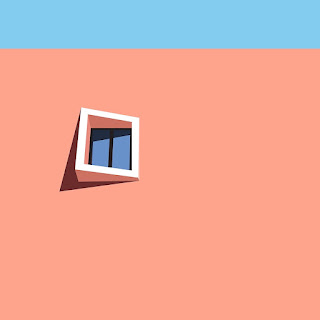
These were my main inspirations, I wanted to create a minimalist artwork. A single object or construction with strong contrasting colours and simple contours that cast shadows to create a sense of dimension.
Idea Exploration
I decided to go with my second sketch and created my design on Procreate.
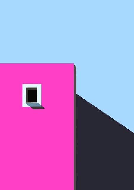
The colour scheme of my design is inspired by Paul Smith's Pink Wall located in Los Angeles, USA. It is special for no other reason other than the fact that it is painted an unmistakable shade of bubblegum pink.
Fig 1.4: Draft 2
Simple contours were added to the back of the building to create shadows and give the whole image a three-dimensional rather than flat appearance.
Final Outcome
Final Contrast Design in PDF
The simple shapes create a contrast between the intense colours of pink and blue, and the shadows add a sense of dimensionality, which I intended to represent in my artwork.
Feedback
Dr. Jinchi went through my idea and agreed it was alright to stay with my present design, so I didn't make much adjustments and opted to go with my outcome.
Gestalt Theory
Gestalt theory is based on the idea that the human brain will attempt to simplify and organize complex images or designs that consist of many elements, by subconsciously arranging the parts into an organized system that creates a whole, rather than just a series of disparate elements.
Visual Research
Idea Exploration
Based on my visual research, I wanted to create a colourful artwork that wasn't only black and white. Initially, I planned to use the Principle of Figure/Ground to develop my design. I sought to employ the idea of a polar bear inadvertently eating plastic (plastic pollution) as the piece's primary expression.
After finishing the first draft, I felt like something was lacking, and I wasn't entirely satisfied with it. So I gave myself the opportunity to experiment with other designs, such as colour changes/placement and pattern elements. Also, I'm attempting to incorporate the Principle of Similarity with Figure/Ground into my work.
Final Outcome
Final Gestalt Theory Design in PDF
Stranded polar bears, mining disasters, oil spills. These are the common portrayals of environmental risk in the Arctic. But there's a less-familiar threat to the pristine Arctic environment that demands our attention too – the growing prevalence of marine litter, and specifically plastic pollution. These pollutants have a significant impact on the Earth's ecosystem, and litter ends up in the tummies of animals, eventually killing them.
My design's message is not only about pollution, but also about climate change in the Arctic. Global climate change is causing the ice to melt, seriously endangering the polar bears' living area. We need to do more to protect these precious creatures.
Feedback
Dr. Jinchi agreed that I could proceed with my fourth draft after discussing with her at the review session. However, she advised that I could improve the colour position (colour balancing) and the polar bear silhouette, as the silhouette does not appear like a REAL polar bear. She also suggested that I include the component of melting snow on top of the mountain to bring my work a dual message, namely the issue of waste pollution and global climate change.
Reflection
When we were assigned this Exercise 1, I had a lot of ideas for Contrast. And surprisingly, after some experimenting, I was able to complete my work with a seamless process. Everything went fine. But when it came to the Gestalt Theory, I struggled a lot because I was afraid of misinterpreting it. I was concerned that my design would be irrelevant to the Gestalt principle throughout the design process. However, Dr. Jinchi was helpful during the consultation process, guiding and inspiring me to execute my work confidently.
I enjoyed the design process, even though I kept reworking, flipping, and beginning over. So, in my following exercises and even projects, I'm looking forward to experimenting and exploring more so that I'm not bound to my thinking and may spark more diverse ideas to create meaningful designs.


Comments
Post a Comment